Monday, 21 September 2015

Is that art or can we sit on it?

Henry Moore; 'Draped Seated Woman' 1957-8

One of our favourite days out is to the magnificent wonderland that is the Yorkshire Sculpture Park. It is one of those special places which lifts the spirits and cleans the soul. Covering 500 acres, there is more than enough walking to make adult legs, let alone tiny ones, rather weary - which is where the title of this post comes from. "Is that art or can we sit on it?" was asked by our then small daughter on her first visit many years ago. The subject of her query was in fact a bench - though we had to admit it was perhaps more aesthetically pleasing than a couple of the sculptures, so we could understand her confusion. (Since then the phrase has become family code to express..ahem..scepticism about artistic merit. Follow us around a museum or gallery and you might hear us muttering it under our breath to each other - most recently I'm afraid in Tate Modern. So we're philistines. What can I say?). Fortunately there are plenty of places provided around the vast spaces of the park for visitors to sit and rest and enjoy the views.

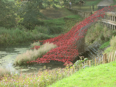
Last weekend my husband and I (along with a large part of the population of Yorkshire, as it turned out) made a special trip to see the newly installed 'Poppies: Wave', a small part of the extraordinary Blood Swept Lands and Seas of Red installation which was at the Tower of London in 2014.

In the glorious autumn sunshine our first glimpse of the poppies in the distance was like a fiery beacon, reflected in the water below. What a fabulous setting for this stunning display.


Even on a busy day the park is so big it isn't too hard to escape the madding crowd and find some tranquility. On this visit I spent quite some time just gazing at the reflections in the Boat House which houses JocJonJosch's 'Eddy'.
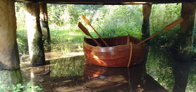

JocJonJosch: 'Eddy' 2014

Another of our favourite spots is James Turrell's 'Deer Shelter Skyspace'. How can a simple* hole in a roof be so effective and mesmerising? But it is - and with the added benefit that this is simultaneously art AND you can sit on it, or at least in it.

James Turrell: 'Deer Shelter Skyspace' 2007


* I have no doubt it isn't simple at all, but very cleverly designed and engineered to achieve the effect it does.

The Poppies will be in place until 10 January 2016, but the Sculpture Park is open all year round and always worth a visit. Entrance is, astonishingly, free - though of course donations are always welcome. The icing, or perhaps gravy, on a great day out is the excellent restaurant which is very good value and serves up a delicious menu.

Pro tips: 
  • Get there as early as you can, especially at the weekends. If you arrive a few minutes before the opening time of 10am you can always set off around the park and open air exhibits before coming back to the visitor centre and indoor galleries.
  • Do pick up a map. You can miss entire sections of the park without one.
  • Parking is by number plate recognition and you can pay at the machines at any time during your visit. Pay early in the day because the queues at the machines can get quite long later. Don't waste time trying to work out how long you will need; just pay for the whole day, you'll use it!

For more information visit www.ysp.co.uk

Sophie Ryder: 'Sitting' 2007

Thursday, 17 September 2015

Abbeys - creating a new series of collagraphs

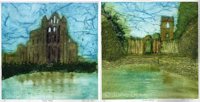
Up to now my collagraphs have tended to be small and detailed, often relying less on the structure of the plate and more on the wiping of the ink. I had an urge to do something a bit bigger and looser, and so the idea of a series of prints of landmarks was born. The first two images which popped into my head were of two of my favourite places in North Yorkshire, which both happen to be ruined abbeys. Here are the finished prints of Whitby Abbey (English Heritage) and Fountains Abbey (National Trust).

Whitby Abbey and Fountains Abbey each 30 x 30 cm

And here's a little about how they are made. The first step is to work out the drawings, thinking all the time of how the layers will need to be built up on the plates and the order in which they will be inked up. Once the drawings are finished they have to be traced onto the pieces of mountboard I'm using as plates (remembering of course to reverse the images!).


Then comes the fun bit of building the plates both by cutting away some parts and by adding collage elements. I use different textures of paper, pieces of fabric and pva glue painted on in lines and smears. It's important to remember these are printmaking plates, not collages, so some parts might be counter-intuitive. For instance look at the middle window on the Fountains Abbey tower on the right; I want to 'see' the sky through this, but instead of cutting away a section of the tower which would then just fill with the ink I use for the stonework and be dark (like the small top window), I have stuck on a piece of plain paper which I will be able to wipe clean and then add a little sky colour at the end.


Once the plate is finished it is varnished with several layers of shellac and left for a couple of days to harden completely. Inking up is a long job and has to be carefully planned (you'll notice planning is a recurring theme in printmaking). There's no point adding ink to one area if it's going to be wiped away when you add another. The photo on the left shows the Whitby Abbey plate with the ink laid on the sky, background and pond. I wipe most of this down before adding the ink to the abbey itself, and then there is a lot of wiping, touching up and more wiping. It takes about an hour to reach the stage in the photo on the right, which is the plate ready for printing.


The really magic moment is when you pass a plate through the press and see for the first time what it looks like as a print. There is always an element of surprise - simply the fact the picture is a mirror image of the plate you have been working on for so long means it looks fresh and new.


Then it's time to clean the plate down, prepare another piece of paper and start inking up all over again.....   I'm planning to get editions of 15 of each print but collagraph plates are fragile things. Look what started to happen to the Fountains Abbey plate after just three prints.


Aaaagh! This will need careful repair and then more varnishing before I can carry on.

And meanwhile I'm thinking about what will be the next prints in this series. All I can tell you for sure is that they will be abbeys or churches. They might be all in Yorkshire.... or they might not. They might all be ruins... or perhaps not. We'll have to see where inspiration strikes. Do you have any suggestions?

Tuesday, 8 September 2015

Seven Plums - watercolour demonstration

I recently took down the demonstration pages that had been on my website for several years. They were getting a bit stale and I'm not planning on reproducing them all here. However this was a particularly popular one and I still refer to it in my Watercolour Improvers workshop, so I thought I'd give it a new home here on the blog.


The idea of this demonstration is to show how careful planning of glazes can produce vibrant and fresh colour, even when using all three primaries layered together. The effect you get from layering in this way is completely different from mixing the same paints together on the palette.

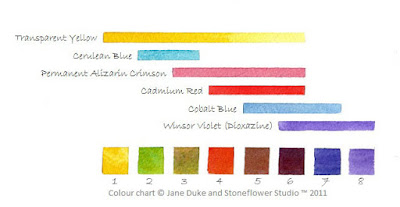
For this study of plums I needed a range of hues including yellow, green, red and purple.  I spent some time experimenting with layering different colours and planning the order in which I would work. The chart below shows the colours I planned to use and the swatches along the bottom show the results of the different combinations.The colours would be layered starting with the yellow and working through to the violet, but not all areas would have all the layers or in the same intensity. For instance the yellow is used more lightly in the areas which will also have cobalt blue and violet to avoid the colours turning dirty green.
All paints are Winsor & Newton Artist range.


OK so that's the planning - now for the execution. The first wash is Transparent Yellow.  It is applied lightly in some areas and in others is not used at all, depending on what the eventual colour is to be. The stalks have been protected with blue tinted masking fluid.


Then Cerulean Blue is added. I add this only where I want to achieve swatches 2 and 3 on the chart.


Then Permanent Alizarin Crimson goes where I want to achieve the colour swatches 3 through to 6. Do you see how this is working?


Cadmium Red goes on next...


..then Cobalt Blue...


..and finally Winsor Violet (Dioxazine). There were just a few tiny areas that have been left unpainted until this point so they now have only pure Violet on them (the last swatch on the chart, number 8).


Here's the finished piece with shadows, lace and stalks added.  The shadows and lace holes are all painted with colours used previously (Cobalt Blue, Permanent Alizarin Crimson, Transparent Yellow, Winsor Violet) but because here the paint has been mixed on the palette instead of being painted in layers on the paper, the result is muted neutrals rather than the vibrant colours of the plums

'Seven Plums' - © Jane Duke 2011

I hope you enjoyed this demo and found it useful. Do let me know what you think in the comments below.

The legal copyright bit (sorry but unfortunately this is necessary):
You are very welcome to follow this demonstration for your own pleasure, but please remember that exhibiting or selling the resulting painting without acknowledgement is copyright infringement.