Showing posts with label step by step. Show all posts

Wednesday, 12 October 2016

Offset printing - transferring a design to multiple blocks

When creating a relief print with two or more blocks, one of the first challenges is successfully transferring the design onto each block so that together they will create a image. Perhaps the most obvious way of doing this is to take a tracing of your design and then use carbon paper to copy it onto each block. There can be drawbacks with this method though. For one thing you need to be very precise; if you draw 1 mm outside the line on one block and 1 mm inside it on another, you end up with a difference of 2 mm which can be enough to make a real mess of your print.

But sometimes you just won't have a  master drawing which is definite enough for you to use it to make each block. Perhaps you have drawn your original design straight onto your block, or perhaps you started with a traced design but have adapted and changed it as you carved that first block. This is where the offset printing technique of transferring a design comes into its own. Here's a quick guide to how it works with a woodcut print.

After carving the first block, it is inked up quite thickly (probably more than you would do for an actual print). You don't need to worry too much about stray bits of ink on the cleared away parts.


This is then printed onto thin paper (eg newsprint). This can be done quickly and easily by hand with a baren when using such thin paper.


Immediately, while the ink is still wet, this thick gungy print is laid face down on your second block. (Make sure it is lined up exactly the same way as your first one). The back is rubbed hard with the baren to transfer the ink onto the second block.


And now you have an exact replica of your first block reproduced on the second one.


From here you can start marking where you want to cut the second block.


In this example, which will be a two block print, I have carved the lighter coloured block first. This provides the structure of the image and the second darker block will be the added details. Sometimes it will be more appropriate to carve the dark second block first, when this is the one with the main features of the image while the lighter colour is looser background stuff like water or foliage. In 'Black Swan and Cygnets' (below) I carved the black block first and then used that to tell me where the lighter parts should be on the second block. When making the actual print, the second lighter block becomes the first block, and the dark block carved first becomes the second block. (Confused? Welcome to the world of printmaking!)


Now that you've got all your blocks carved - there might be more than two - you can tweak and refine them as you make proof prints. As with all carving of printmaking blocks, it's good to start off with simplified shapes and then develop the details; you can always carve away more but you can't put bits back.

Wednesday, 17 February 2016

The making of Velvet Ears

Social media can open interesting doors and make unexpected connections. I created this print last year, based on a photo taken by one of my online pals (whom I have never met in real life) of a puppy belonging to friends of hers. A few tweets gave me the permission of both the photographer and the puppy's owners to turn the image into a collagraph monoprint, and as a thank you the first two prints from the edition went to the parties concerned.

Although each print in the edition of 15 is made from the same plate, the image is created by wiping and removing ink in a painterly way. The results will therefore be slightly (or even greatly) different each time, making each print a monoprint. This is easier to show than to explain so I have finally got around to making a video of the process.


After giving away the first two prints in the edition, I put another one in the Taster Exhibition for last year's York Open Studios, where I am pleased to say it was the first sale made. Others from the edition are now available in my shop.


Sunday, 7 February 2016

Just a print

Last Christmas I sent tiny etchings to some of my friends and family; each one was a numbered and signed print from a limited edition of 50. Most thanked me for their print but a couple thanked me for their 'card'. I smiled and nodded and fought back the temptation to ask anxiously if they had dropped it in the Christmas card recycling point at the supermarket, or cut it up to make a tag for next year's wrapping. How could I correct them without sounding like a bossy teacher or an over-sensitive artist? Finally one lovely friend phoned and gave effusive thanks and said she would treasure her little robin as a "Jane Duke original", but then corrected herself and said "... of course I know it's not really an original, but it is to me".
"No, no" I replied, "it is an original."
"Really?" she said, surprised and delighted, "Oh I thought it was just a print!"

'Robin'
Drypoint etching 6 x 6 cm

It's easy to see why there is confusion; despite having one of the richest vocabularies in the world, the English language still uses the same word to mean an original piece of art hand created by the artist and a scanned reproduction of an image run off on a machine. The problem has been exacerbated since the 1990s by artists selling giclée (inkjet) reproductions of their paintings as 'limited edition prints'. You can hardly blame the non-artist public for not immediately making the distinction. So what are printmakers to do to protect our craft? We can sulk and stamp and weep or we can quietly, determinedly and politely make it possible for people to see and understand what we do.

I enjoy giving short demonstrations at art events and in my studio during the York Open Studios weekends, and I also have leaflets on my stand at art shows, explaining the processes. I post step by step demos and photos of work in progress here on the blog and I have put a printmaking guide and a glossary of terms on my website. And then of course I also teach workshops for those who are curious enough to want to try for themselves.

I've now taken another step, and after wrestling with self consciousness and fear of making a hash of it, I stuck my phone in a clamp, switched on the camera and made my first YouTube video. Appropriately perhaps, it shows the making of that little Robin etching which was given out at Christmas and which brought some misunderstandings to light. I'd love you to watch it if you have 5 minutes.


Now I've made this leap I will be making more of these videos. I hope they help to spread the word about what printmaking is, on behalf of all printmakers whose work is so much more than 'just a print'.

At the time of writing the remaining 'Robin' prints in the edition can be purchased in my shop

Tuesday, 6 October 2015

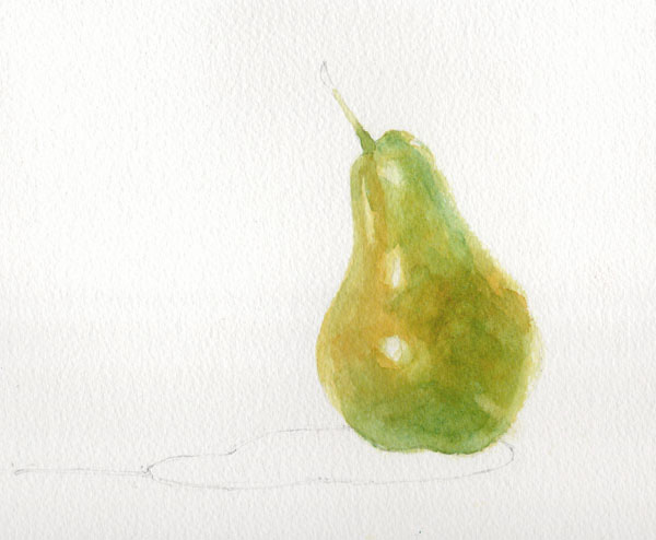
Painting a pear - a watercolour demonstration

For a long time the finished pear in this demo was my logo, and in fact it's still hanging around on business cards, labels and signage. (Well you don't expect someone from Yorkshire to chuck out perfectly good stationery do you?) A step-by-step demonstration showing how I painted it was on my website for a couple of years but this took on a life of its own and spread across social media, forums and Pinterest boards, often without attribution, and copies started popping up with other artists' names on. Eventually the day came that someone saw my signage at a show and said "Oh I know where that pear comes from; you got it off that demo on Facebook, didn't you?". Enough was enough.

I took the demo down from my website and instead made it available as a free pdf which people could request by email for their own personal use. All continued happily until someone casually mentioned that she ran art workshops and she was going to print off lots of copies and use them for classes. Errm... excuse me but no.... write your own course material and handouts LIKE I DO.

At that point I'm afraid I took my ball home and withdrew the demo completely for a while, but being a kindly and generous soul I'm now sharing it with you here. I hope you find it useful - if you try it then please do leave a comment below and let me know how you get on.

*******************

The demonstration shows how to develop colours using wet on dry glazing - this technique exploits the translucent qualities of watercolour so that underlying colours affect and alter the colours painted over them.  It is vital for this method that each layer is allowed to dry completely before adding the next. (All paints used are Winsor & Newton Artist quality).


The painting begins with a layer of Transparent Yellow applied with a size 8 round brush.  The brush should always make first contact with the paper where you want the colour to be strongest; do not simply start at the edge of a shape and 'colour in'.  Here the paint goes on first at the bulge of the pear where it is closest to the viewer; this will help create a sense of form and depth.


Before the paint dries, a clean damp brush is used to soften the edges to increase the sense that sides of the pear are receding.  The edges of the reserved highlights are also softened in the same way.


The first layer is allowed to dry thoroughly.  Before moving on, the pencil outline of the pear is carefully erased before further paint and water can seal it in.  A layer of Quinacridone Gold is added to the warmest areas of the pear skin.


In the next layer we can begin to see the effects of glazing with transparent colours.  A wash of Permanent Sap Green is applied to all but the yellowest areas.  On its own, Sap Green would be too cold and harsh but layered over yellow it softens and mellows.  Again the colour is strongest in the centre, softening towards the edges.  The green is carried a little way up the stalk too to aid continuity later.

Once the painting is dry again, Cerulean Blue is added to areas in shadow.  The effect over the previous yellow and green is to produce a dark green.  Cerulean Blue is a granulating colour so as it dries it will help to add texture to the painting.


The delicate dark green mottling on the skin is painted with a size 4 brush in Winsor Blue (Green Shade).  Tiny dots are added first and then immediately softened and blended with clean water.  It is important that the dots are not allowed to dry before they are softened so you need to work on small areas at a time, moving steadily across the painting.


The same technique is then used to add the red mottling. This is predominantly Cadmium Red which is a strong opaque colour and needs to be used with care.  Kept thin and light at the edges it blends into the earlier colours, but used more strongly in the centre, its opacity means it can stay bright zingy red without being compromised by the underlying green.  In areas which need to be less bright but still strong, a little Permanent Alizarin Crimson is used.


The stalk is painted with a size 6 round brush in Burnt Umber with a touch of Winsor Blue (Green Shade) dropped in half way along.  The colour is blended into the flesh of the pear to make sure the stalk grows out from the fruit and is not 'stuck on'.  The very end of the stalk is deliberately blurred with clean water so that the eye is not drawn to a hard edge and distracted from the pear.
The shadow shape is first painted with clean water.  Winsor Blue (G) is then added in the strongest area on the right and coaxed along to the rest of the shadow shape.  While it is still wet some Sap Green, Transparent Yellow and a tiny amount of Cadmium Red are added to the shadow to indicate reflected colour from the pear.  When the shadow is dry, the area immediately under the pear is strengthened with strong mix of Sap Green and Winsor Blue (G).

Pear with Shadow - © Jane Duke 2011


Tuesday, 8 September 2015

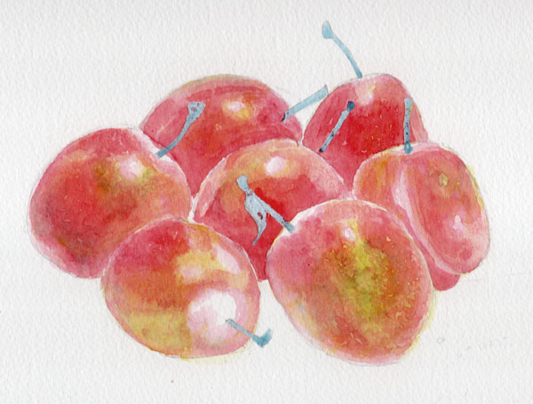
Seven Plums - watercolour demonstration

I recently took down the demonstration pages that had been on my website for several years. They were getting a bit stale and I'm not planning on reproducing them all here. However this was a particularly popular one and I still refer to it in my Watercolour Improvers workshop, so I thought I'd give it a new home here on the blog.


The idea of this demonstration is to show how careful planning of glazes can produce vibrant and fresh colour, even when using all three primaries layered together. The effect you get from layering in this way is completely different from mixing the same paints together on the palette.

For this study of plums I needed a range of hues including yellow, green, red and purple.  I spent some time experimenting with layering different colours and planning the order in which I would work. The chart below shows the colours I planned to use and the swatches along the bottom show the results of the different combinations.The colours would be layered starting with the yellow and working through to the violet, but not all areas would have all the layers or in the same intensity. For instance the yellow is used more lightly in the areas which will also have cobalt blue and violet to avoid the colours turning dirty green.
All paints are Winsor & Newton Artist range.


OK so that's the planning - now for the execution. The first wash is Transparent Yellow.  It is applied lightly in some areas and in others is not used at all, depending on what the eventual colour is to be. The stalks have been protected with blue tinted masking fluid.


Then Cerulean Blue is added. I add this only where I want to achieve swatches 2 and 3 on the chart.


Then Permanent Alizarin Crimson goes where I want to achieve the colour swatches 3 through to 6. Do you see how this is working?


Cadmium Red goes on next...


..then Cobalt Blue...


..and finally Winsor Violet (Dioxazine). There were just a few tiny areas that have been left unpainted until this point so they now have only pure Violet on them (the last swatch on the chart, number 8).


Here's the finished piece with shadows, lace and stalks added.  The shadows and lace holes are all painted with colours used previously (Cobalt Blue, Permanent Alizarin Crimson, Transparent Yellow, Winsor Violet) but because here the paint has been mixed on the palette instead of being painted in layers on the paper, the result is muted neutrals rather than the vibrant colours of the plums

'Seven Plums' - © Jane Duke 2011

I hope you enjoyed this demo and found it useful. Do let me know what you think in the comments below.

The legal copyright bit (sorry but unfortunately this is necessary):
You are very welcome to follow this demonstration for your own pleasure, but please remember that exhibiting or selling the resulting painting without acknowledgement is copyright infringement.

Wednesday, 22 July 2015

Robin Nest - printing a collagraph

One of the most common questions I get asked at shows is "How long does one of these take you?". The poor unsuspecting enquirer is probably expecting a simple two word answer starting with a number and ending with a unit of time, but I'm afraid instead they get an explanation of the many variables of printmaking. I try to stop talking before their eyes glaze over too much.

With some forms of printmaking, the time-consuming bit is carving and creating the plates from which the print is made, while the actual printing is a relatively quick whizz with an ink roller and a pass through a press. With others the plate might be fairly simple, but inking up for each individual print is a slow and painstaking job. The collagraph print I'm going to show you here is one of the latter. The plate was made from a piece of mountboard (or matboard if you're in the US); some parts were incised to remove the top layer while in other areas texture was created by sticking on elements including thread, paper shapes and lines of pva glue. Once finished the plate was sealed with several coats of shellac.


The first colour to be applied was a pale green blue for the twigs in the nest. This had to be pushed right down into the incised areas so I used a toothbrush to work it in. The ink was the thick and sticky consistency you would use for other intaglio methods (eg etching) so it would stay where it was put and not be easily wiped out again.


I didn't want much of this colour on the surface of the plate so I wiped the excess off with a piece of scrim and to make some of the marks even clearer I cleaned up around the edges with a cotton bud.


Then I added a green ink with a roller. Now I was working in a relief method so the ink just lay on the raised surfaces not in the indentations. The ink was loosened to a relief printing consistency for this using an extender. After inking, the outer area was softened and blurred by wiping with scrim, while the centre part was cleaned up with a rag to remove as much ink as possible


The middle of the plate was now inked up with a brown colour. This was another time that I needed the ink to be pushed right down into the nooks and crannies, so I used a poupée; meaning 'doll' in French, this is a thick soft stump made by screwing a piece of rag into a ball and then wrapping and taping or tying another piece round it.


Then I used another piece of clean rag to take the brown ink off the paper eggs in the centre and yet another to wipe some pale blue ink directly onto them. (Worn out shirts never get wasted here.)


Finally, after around half an hour of adding and wiping ink the plate was ready....


... to be passed through the etching press with a piece of dampened printmaking paper, and a print was pulled.


And then it was time to clean up the plate and do it all over again. After seven prints the fragile plate began to degrade and that was the end of the edition. Each print inevitably came out differently so the prints are numbered with the annotation 'VE' for 'variable edition'.