Showing posts with label how do you do that. Show all posts

Monday, 26 February 2018

Testing, testing

I've started my first new work for a long time. If you follow me on social media you might know I had an accident at the end of last summer that wiped me out for quite a while. As well as the practical issues of being unable to walk for several months, the overwhelming tiredness of a body throwing all its resources into healing meant that I completely lost my printmaking mojo.

But now I'm back, and as I have found I am rather rusty this seems like a perfect time to talk about proofing and testing new prints and correcting mistakes. A lot of art blogs present the perfect finished article - so for a change I'm going to show you what goes wrong.

To make life hard for myself, my first new print is a Japanese watercolour woodblock (moku hanga), which demands quite a high level of technical proficiency. Maybe I should have eased myself back in with a single colour linocut.....

Anyway, I had in my mind's eye an image of a wooden Russian doll. I wanted to use the moku hanga shading to create the rounded shape and shiny varnished surface of the doll, as if I were painting it in watercolour, but also wanted to include the folk art hand painted decoration. My plan is to add the line detail to the finished and dried prints with a brush so that each print is unique, just as each hand painted doll is unique.

I have two sets of Russian dolls. I have had them so long I can't even remember where I got them, though it is likely the older and larger one was a gift from my merchant seaman brother who used to bring me back a doll from every country he visited when I was a small child. That makes it nearly 50 years old which explains why the outer doll is so faded.


My design is a sort of composite of all these dolls, and was transferred onto six different blocks for carving and printing. I printed up four test prints, each of which had different things wrong with it, which can be frustrating but is also the point of proofing.

From a distance these look like a good start, but when you get close...... oh so many mistakes....


Lets's start with the registration, which means lining up the paper on each successive block correctly so that the different elements match. These two sections are meant to lie next to each other, not have a gap between them. Oops.
The tricky bit here is working out what went wrong. Japanese woodblocks are lined up using kento slots cut in the wood. It should be foolproof, but pushing the paper half a millimetre more firmly into one slot than the other can create distortions of several millimetres at the other end of the block. Once I'd worked out what was going on with this block I wrote a note on it to remind myself to drop the paper into place a certain way in future.


There's no excuse for the registration mess here though, with two layers being printed out of alignment. It's one block being used for successive layers so this is purely user error and sloppiness on my part. Must do better.


This granulating effect is caused by insufficient nori (rice flour) paste being blended with the watercolour. It can be used deliberately to get an interesting texture but is not what I want here where I'm trying to depict smooth varnished wood. Must be more careful next time.

The mix on this print is more successful and the shading is working quite well to create a 3D effect (notice the highlight towards the left). I want this effect to be stronger though, so on the finished prints I will start with an even lighter layer and build up the shading to even darker red. This test print used about three or four bokashi (shading) layers; I probably need to do six or seven.

These marks around the image are where the watercolour has strayed onto the surrounding block and been picked up on the print. There are various ways to tackle it:
1. Carve away more wood, especially if particular spots keep causing problems.
2. Clean up more thoroughly around the inked area before printing.
3. JUST BE MORE BLOOMING CAREFUL.


A quick test run of the hand painted details went well, so now it's time  to prepare the paper and mix up a new batch of nori paste, ready for printing tomorrow. Watch this space.

UPDATE: the finished print can be seen in this blog post.


Monday, 24 October 2016

Life Drawing (titter ye not)

Life drawing, you know ....where a model sits in front of everyone in the nude... the premise of so many hi-lar-ious sitcom scenes, sketches and tv adverts. A proper giggle, isn't it? Well, no actually, which is why an email I got several years ago shocked me so much.

To begin at the beginning, drawing from life, that is, drawing or painting anything that is actually there in front of you, is undoubtedly harder than drawing from a photo; your brain has to convert a 3D experience into two flat dimensions, the slightest change in viewpoint will drastically alter perspective, and sometimes your subject will wilt, wither or move in the wind.

Within this, drawing a portrait of a person is even harder. An obvious issue is that your subject probably won't stay still. A definite wriggle is not such a problem; the danger is the slow and subtle slump. I once attended a class where we were instructed to paint a portrait one feature at a time, with no drawing and, importantly, no initial mapping out of the body and face. Unfortunately we realised after two hours that our (expensive and supposedly professional) model had been slowly turning in her seat throughout the session, and as a result the entire class' output was an exercise in Cubism with every portrait depicting features and limbs painted from different angles.

On top of these practical problems are the additional psychological hurdles; we all know it is Rude to Stare. New students of portrait painting find it surprisingly hard to examine another person's face in calculating and objective detail. And if it is hard to study someone's face, consider then what taboos we come up against when dealing with Life Drawing: that all encompassing euphemism which means, essentially, drawing or painting a fellow human being with no clothes on. (NB for it to be Life Drawing it has to be the model who has no clothes on. If the artist is the one with no clothes on then that is just weird and doesn't, as far as I'm aware, have a specific name.)  We are all carrying around several thousand years of conditioning that, unless you work in a very limited and specific set of professions, you Do Not Look at Someone's Bits.

Pile all these issues together and a Life Drawing session can be as exhausting as a gym workout. The levels of concentration are tremendous and are multiplied by the brain trying to do mental back flips and normalise the idea of a complete stranger lying naked in a contorted pose in a brightly lit room full of clothed people who are (hopefully) not there for sexual titillation and without anyone admitting it's weird. I find it interesting to observe the behaviour of artists in a life class; people often become either exaggeratedly studious (I am a serious artist), excessively casual and jokey (I'm not uncomfortable AT ALL) or affect an other-worldly lack of awareness (model, what model?). On one occasion I saw an artist cross the room by stepping over the prone model as if she were an inanimate object. I can understand how his coping mechanisms led him to do it but it was still bloody rude. Yes you get better at coping and less unsettled the more sessions you attend, but the dichotomy is that you really cannot assume a level of clinical detachment without losing the emotional involvement that is necessary to produce art. In order to produce a portrait you can't stop responding to the model as a living, breathing.....naked... human being.

This is why I sigh heavily when I see yet another tv sketch set in a life class, but that irritation is tame compared to the email I mentioned. In it I was asked to act as the tutor for a new venture offering 'Leisure' life classes. On further enquiry these turned out to be hen parties where tipsy women would 'draw' a nude male model. Hysterical, no? When I expressed concerns that this cheapened art and was disrespectful of the models I was told that they were fully aware of what was involved, that no-one was making them do it and that they would be paid the going rate. Now where have I heard those arguments before? Needless to say I didn't accept the booking.

(Oh and by the way... if you have read this far and think I was overreacting and being prudish, please substitute 'stag parties', 'tipsy men' and 'nude female model' in the previous paragraph. Maybe then it doesn't sound such a jolly jape.)


To end then, if you are an artist, or indeed a model, who takes part in life sessions, I'd be interested to hear your thoughts. (Would you have taken that booking?). If you are an artist who has never tried life drawing then DO IT - it's a fantastic challenge and will shake up your work. If you are an art lover, then I hope that having read this you will see nude studies in a different light and perhaps have a refreshed appreciation of what goes into them.

All illustrations are my own pencil and watercolour sketches made in short pose life sessions.


Wednesday, 12 October 2016

Offset printing - transferring a design to multiple blocks

When creating a relief print with two or more blocks, one of the first challenges is successfully transferring the design onto each block so that together they will create a image. Perhaps the most obvious way of doing this is to take a tracing of your design and then use carbon paper to copy it onto each block. There can be drawbacks with this method though. For one thing you need to be very precise; if you draw 1 mm outside the line on one block and 1 mm inside it on another, you end up with a difference of 2 mm which can be enough to make a real mess of your print.

But sometimes you just won't have a  master drawing which is definite enough for you to use it to make each block. Perhaps you have drawn your original design straight onto your block, or perhaps you started with a traced design but have adapted and changed it as you carved that first block. This is where the offset printing technique of transferring a design comes into its own. Here's a quick guide to how it works with a woodcut print.

After carving the first block, it is inked up quite thickly (probably more than you would do for an actual print). You don't need to worry too much about stray bits of ink on the cleared away parts.


This is then printed onto thin paper (eg newsprint). This can be done quickly and easily by hand with a baren when using such thin paper.


Immediately, while the ink is still wet, this thick gungy print is laid face down on your second block. (Make sure it is lined up exactly the same way as your first one). The back is rubbed hard with the baren to transfer the ink onto the second block.


And now you have an exact replica of your first block reproduced on the second one.


From here you can start marking where you want to cut the second block.


In this example, which will be a two block print, I have carved the lighter coloured block first. This provides the structure of the image and the second darker block will be the added details. Sometimes it will be more appropriate to carve the dark second block first, when this is the one with the main features of the image while the lighter colour is looser background stuff like water or foliage. In 'Black Swan and Cygnets' (below) I carved the black block first and then used that to tell me where the lighter parts should be on the second block. When making the actual print, the second lighter block becomes the first block, and the dark block carved first becomes the second block. (Confused? Welcome to the world of printmaking!)


Now that you've got all your blocks carved - there might be more than two - you can tweak and refine them as you make proof prints. As with all carving of printmaking blocks, it's good to start off with simplified shapes and then develop the details; you can always carve away more but you can't put bits back.

Wednesday, 28 September 2016

Four Seasons: a collagraph series (Part Two - how they were made)

In an earlier post I wrote about how this series of collagraphs came about and I promised to write in more depth about how they were actually made, so here it is.

As with most of my prints, this one started off sketched out on the back of an A4 piece of paper from the scrap paper drawer. (This disorganised scruffiness is why people who ask to see my sketch books are often disappointed.) Actually I suppose it really started in my head, appearing there unbidden as these things often do, and the trick was to keep it there until I had a chance to draw it. I can't be sure but I have a lingering fear that a lot of my best ideas have vanished like mist burning off in the sun. I will never know.

Once drawn out I then transferred the image onto a piece of mountboard which I would use as my plate. I flipped the image so that the print would come out the same I way I had originally created it. You might think that for a scene like this that doesn't really matter, but it does to me....

From sketch to plate

Now it was time for the fun part, sticking and cutting and messing about with collage. Well maybe not so much of the messing about. It is fun, but there is rather more to it than making a simple collage. As well as the shapes and texture I also have to consider the way different surfaces will take up the ink. I have to think ahead to the practicalities of inking up the plate and also remember that those parts most prominent on the plate will recede on the print. As with all printmaking, everything has to be done in reverse, like living in Alice's Looking Glass world.

Once complete the plate needs to be varnished on both sides

Inking up was a slow job, carefully applying the ink to different areas and then wiping away to get the right amount of coverage for each section. Some parts needed to be left with a good coverage, some needed to be cleaned and polished almost to whiteness. Each season in this series of four prints required not only different colours but also its own inking and wiping order. I made swatches at the end of each initial printing session so I could replicate the colours for subsequent ones and I also made notes in my print 'recipe book'.

Applying ink and then wiping and burnishing it
And then it was time to print. A registration sheet laid on the printing press is always useful to centre the plate on your paper, but for this print it was absolutely vital. The plate is in two parts and these had to be placed in exactly the same relation to each other on every print.

The registration sheet (left) and 'Winter' ready to print (right)

Damp prints are taped to boards so that they dry flat - seen here 'Autumn' and 'Summer'

Collagraph plates are fragile and I knew I was asking a lot of this one to survive printing editions of four different prints. Sure enough, some over enthusiastic cleaning at the end of one printing session ended up with the tree trunk tearing. Aaagh! You might think I could simply tape a cocktail stick on the back to hold it together, but this would make enough of a ridge to make the plate unusable. Any repair has to be as flat as possible. I glued the torn edges together and then carefully applied a single piece of paper to the back before varnishing the area again. The join will show on prints but as the tree trunk was textured anyway I think I got away with it.

Emergency repairs

And finally the four seasons were complete. A framed set will be exhibited at the Yorkshire Museum of Farming from 15th - 30th October 2016 and unframed prints are now available in my shop.


Tuesday, 9 August 2016

Here today, gone tomorrow - the liberating impermanence of Instagram Stories

I have to admit I had fallen out of love with Instagram since the recent change to a non-chronological timeline and had pretty much stopped looking at it. All that has changed in the last few days with the arrival of 'Stories'. I have been completely won over and now visit Instagram several times a day.

If you haven't yet discovered this new feature, launched last week, Stories are made up of photos and (very) short video clips, uploaded to Instagram without the usual panoply of captions and hashtags. There are no filters or cropping; the aim is for honesty and spontaneity. You can cheat a little by uploading an existing photo or video from your phone but only if it is less than a day old. Viewers can't comment or like; the images are simply there to be briefly enjoyed because (and this is the important bit) after 24 hours they vanish, like a mayfly. New images are added to the end of the story reel while the older ones at the beginning disappear.

I was highly sceptical when I first heard about this but within hours I was converted. Not only do I enjoy the tiny glimpses of others' non-styled, non-filtered and non-curated days but I quickly realised how perfectly this suits documenting the daily life in an artist's studio.

A still from a 7 second clip of cutting out a collagraph plate.

I am happy to make demonstration videos showing my methods, but they are a lot of work and they have to be (or at least appear) perfect. I don't mind people seeing the less perfect bits - I am told my workshop students get a lot of help from seeing me make mistakes (or perhaps they are just being kind) - but I would hate the scruffy part of my work to be permanently archived on the internet. These ephemeral collections of little clips which come with no commentary or narrative offer a wonderful licence to share without fear.

So now I am regularly adding snapshots or a few seconds of video of what I am doing. There is no need for me to record an explanation, think up tags or even worry if the finished piece will be up to scratch. My story includes glimpses of the stages of printmaking, views of my surroundings, things that catch my eye, sources of inspiration (and, I will admit, the odd cat photo - well it is Instagram after all).  I'm hoping that as people see my story unfold they will begin to recognise the processes and routines of my working life. Perhaps they will want to visit my website or this blog to find out more. Maybe fellow artists will find some of what I do reassuringly familiar. It could be that a viewer will decide to come to a workshop. Or perhaps they will simply understand a bit more about what artists do all day.

Instagram wouldn't be the same without cat photos.

If you would like to find me on Instagram I am @stoneflowerjane. To see someone's story, visit their profile and if they have a new story that you haven't seen yet then their profile photo will be circled in colour. Simply click to view. Meanwhile on your usual Instagram feed, people you follow with stories to see will appear across the top in a banner. At the time of writing stories can be seen only on mobile devices. To find out more about Instagram Stories and how to make your own, there is a short guide here.

Monday, 27 June 2016

Anatomy of a scam

I wonder if anyone has researched how much time lapsed between the invention of email and the first use of it to attempt a scam. I would like to think it was longer than half an hour.

The arrival of email made life easier for all of us but unfortunately that included petty criminals and con artists who no longer had to go to the trouble of knocking on doors, picking up a phone or paying for a stamp. Now they could target hundreds of potential victims with a single click from the comfort of their own homes. Many of these scams are ridiculously easy to spot (you didn't really think an uncle you had never heard of had died in Brazil and left you $10,000,000 did you?) but a worrying number are apparently sufficiently plausible that people are still being taken in and robbed. In this post I am going to explain how scams on artists work (both what the crooks hope to achieve and why people fall for them) and how to spot a typical one.


Who are the victims? Why are they singled out?

The less experienced you are in doing business, the easier you are likely to be to con. This is why private individuals using sites like eBay and Gumtree are often targeted. Unfortunately, the scammers have realised that this lack of business acumen often applies to artists and craftspeople too; when someone whose total previous experience of commerce has been the local village fete decides to open a worldwide online shopfront on Etsy or their own site, then they are seen as ripe for picking.

Who are the crooks?

They can be anyone, but a high proportion originate in Africa and the emails often come either from there or, increasingly frequently, from temporary residents in Europe. This statement is not the product of horribly racist and bigoted prejudice, but a pragmatic description, and in fact the commonly used term '419 scam' derives from a section of Nigeria's criminal code which deals with fraud. Sadly Nigeria was indeed the birthplace of a lot of this activity, due to a perfect storm of political, economic and societal factors which it would take longer than one blog post to unpick.

What are they trying to steal?

They want your money. That's it. It's as simple as that. This is where, I'm sorry to say, artists are particularly vulnerable. There is a natural instinct, born of a little vanity, some insecurity and a lack of experience in the art market, that encourages people to believe that their artwork is so valuable someone would go to elaborate lengths to try stealing it. They focus on protecting that, often responding to warnings from others with things like "I'm not stupid; I won't send my painting until the cheque has cleared", and completely miss where the danger really lies. Think of it like someone making a grab for your phone in the pub. You thwart them and sit down feeling pleased and triumphant, only to hear your car revving up in the car park. While you were concentrating on your phone the thief had been going for your car key.

How does it work?

The most common scam is an overpayment. Having gained your trust (by the simple expedient of complimenting your artwork, so desperate are many artists for validation) they either 'accidentally' or with forewarning send you too much money. If it's an 'accident' you might be asked to send the excess back or forward it on to a third party, perhaps even keeping a little for your trouble. Or if forewarned you might be told the crook owes some money to a friend in your country or needs to send some funds to a relative, and with exchange rates and money transfer charges it would be really helpful if they could send it to you and you send it on. Because THEY trust YOU (ha ha ha). Most commonly of all, the extra is to pay the shipping company that the buyer has arranged (see how to spot scams below) and you might be asked to send payment to them. In the most audacious examples, the 'shipping company' (ie associates of the scammer, or even the scammers themselves) will actually turn up to collect the artwork or other item and take payment there and then. (So then yes you lose the artwork AND the money  - and guess what, the crooks don't care about the artwork and will most likely dump it. Seriously - phone/car key).
But how can you lose money? If you just wait for their cheque to clear then you're safe, right? WRONG. A cheque will be deposited into your account with only the most basic authorisation. Banks do not have time to scrutinise and authenticate every piece of paper that passes through their system and a faked cheque or money order might not be spotted for weeks, even months. And then you lose your money. You can't get back the money you sent on. You have no recourse.

How to spot a typical approach

There are many small clues (and some massive ones) to look out for; each on their own might not be conclusive evidence, but put together they tell a story. Here's an email I received last week. Have a look at it and then see how many of the clues listed below are there.
Sender: john page
Email: REMOVED
Sender IP: 86.187.164.200
--------------------------------------------------

Hi,
Am John Page, I would like to place an order from your store for my daughter wedding gift,but i would be glad if you can list some of the items you have for sale with the prices,also my only method of payment is by Bank Check.
So, I will be happy to hear back from you if you can email me on my private email (REMOVED) for more details like the names and the prices you  have for sale.
       Waiting for your reply.
         Thank
          John.Page

Poor English/grammar/punctuation

We all make mistakes, and plenty of educated and highly qualified people can't spell (*stares at husband*), but use of American spelling in an email purporting to come from someone British is a small red flag. Bad grammar and strange syntax are stronger indicators that someone is not typing in their first language, and when an email claims to be coming from a doctor or lawyer (as they often do) you would definitely expect a more professional finish, or at least a passing acquaintance with spellcheck. Of course the fact that someone is not typing in their own language does not make them a crook, but if they are presenting themselves as a London based professional with an English name then it might cast doubt on their honesty. On the subject of names, these scammers often take inspiration from literature and history assuming that they must be credible English names. I have had emails from Lorna Doone, Robert Peel and Winston Smith. I'm sure there are real people out there with these names (what were their parents thinking?) but as I said earlier, all the little clues add up.

Odd use of language

You can save a lot of time by immediately deleting any email that starts 'My dear' or 'Dearest'. No need to read any further. Trust me.


Lack of specific detail

'I would like to buy some items, I wish to order artwork, I want to buy a painting.....'
Really? Just anything? You would think someone who has fallen in love with a pricey bit of artwork would be a bit more specific. Actually the more cunning scammers will name a particular piece, but 9 times out of 10 it will be the first one shown on your gallery page. The REALLY clever ones name the second one, because you'd never rumble that...
(Most hilarious are the ones which name an artwork but have failed to remove the [brackets] from the template they got from the cons4u scammers forum).

Asking for information readily available on your site

'Please send me a list of items and prices'. It's right there on the site, dude. Why are you wasting my time? Oh that's right, because you're trying to engage me in conversation and find out how gullible I am.

Mentioning shipping

Any mention of shipping is an IMMEDIATE KLAXON. (See 'How does it work?' above). Delete, delete.

Commonly used scenarios/back stories

You will start to recognise recurring themes such as the wedding gift for a daughter in this example. There was a time when a lot of people were moving into new apartments and wanted to 'beautify their homes' (see 'Odd use of language' above). A very common scenario is someone having erratic internet connection which apparently explains why they need to pay by money order, and the most widespread cause of this unreliable connectivity is being an oceanographer. It seems like every oceanographer in the world is bobbing around on the sea looking for artwork in the precious minutes they can get an internet signal.

Dictating payment method

'Yes I know your site allows quick, easy and completely secure international payment by credit or debit card but here I am in London in 2016 and the only way I can pay you is by cheque or money order, but that's OK because you will be so delighted to make such a big sale it won't occur to you to question why.'

Their visit to your site


It can be very useful to check your web traffic to see how this person reached you and behaved on your site. In this instance 'John Page' went straight from the home page to the contact page and had fired off an enquiry in minutes. GENUINE BUYERS DO NOT DO THIS. Real customers take their time. They have a good look at several items, they probably wander further off into the site and look at your 'about' page or cv to get a feel for who they are buying from. They might click on the terms and conditions and delivery information, or have a look at your events to see if you're exhibiting near them. They are very likely to go away and have a think and then make a second or third visit. Think about your own activity on shopping sites - believe me you are normal.
Incidentally, I have obscured the website from which this scammer arrived as it is an innocent third party, but I can tell you it is an old link on a French site which lists me incorrectly as an English watercolourist. Another huge red flag (if I needed any more) is that this visitor clearly has no knowledge of or interest in what I actually do.

So now you can spot a scam, what should you do?

That's easy. DELETE DELETE DELETE.
Yes it is tempting to contact the writer and give them a piece of your mind. It is even more tempting to tell them you have blown their cover and deride their pitiful attempts to trick you. FOR ALL OUR SAKES YOU MUST NOT DO THIS. In the short term, any communication at all makes you vulnerable. The tiniest snippet of information you reveal can and will be used against you in the future - that includes your IP address which you have given to the scammer simply by replying. At the very least you have shown your email address is live and active and you will thus get added to a dozen scammers' mailing lists. Most importantly though, every email that tells them how they went wrong and what mistakes they made educates them and makes their next attempt on some other poor soul more likely to succeed. Why the heck would you want to help them and give them tips on writing plausible emails? This is why I have removed the email address above because someone reading this blog (no not you obviously, you're smarter than that) will not be able to resist contacting the scammer and telling them about this post.

So there you have it. I hope some of those reading this will find it useful. At least one person (again not you) will believe they know better and that I am being unduly suspicious and thinking the worst of people. You can find people like that on online forums every day. Sadly the scammers can find them too. Don't be that person.


Friday, 10 June 2016

Everyone's a winner

A few weeks ago I wrote about the growing problem of filling workshops: an issue which appeared very suddenly a couple of years ago and which has got steadily worse since. It seems I really struck a chord as that post has had more views than the rest of my blog (mostly much more cheerful posts) put together and a lot of fellow artists and tutors got in touch, both on social media and privately, to tell me they have been having exactly the same problem.

I promised that if I came up with a solution I would post it, so here it is. Actually it's a bit early to tell if it's a solution, but it's an idea anyway, and one I am happy to share with workshop organisers.

I, like most workshop providers, used to publish a list of workshop dates ready to receive bookings. The dates would go in my diary and I would keep those days free, often for months, all the while not knowing if those dates would suit anyone else but me. Meanwhile prospective students would visit my site, find that the only dates I offered clashed with their holiday, or a friend's wedding, or a cup final, or the date was fine but not the workshop theme, and go away again without ever contacting me and letting me know they were interested.


So here's the new plan:


My site now suggests a list of dates and invites students to pick one and register their interest via a form* on the page. Once I know that at least one person wants a workshop that day I will add it to the shop as a bookable class and fix it in the diary. The list of available dates will then be adjusted (for instance if someone wants a one-day workshop on a Saturday then that weekend will no longer be an option for a two-day workshop), but I will also add new dates as a calendar begins to take shape.

*Crucially only one date can be picked from a drop down list. The idea is to reach a decision, not be back where we started with nothing being settled. 


Choice

Students now have much more choice and will find it easier to fit a workshop into their other commitments. New dates will be added frequently instead of a schedule being announced a couple of times a year.
Result: happy students
Meanwhile I don't have to keep a date free and turn down other opportunities and invitations. If something comes up for a date which has not yet been fixed as a workshop then I can simply remove it from the list of possibilities.*
Result: happy me

*As if to demonstrate, this actually happened while I was writing this. An invitation to an event popped into my Twitter inbox and I nipped off to amend the dates on my website. 


Flexibility

Now I can respond to people's wishes instead of having to try to guess what they might be. If someone is interested in woodcut they can pick any weekend on offer; nothing will be already earmarked for linocut. If they want a linoprint class on a Sunday instead of the usual Saturday then it's no problem. They just need to let me know, and now they can without having to feel awkward.
Result: everyone wins

Transparency

It has always been the case that a workshop would run only if enough bookings were received, but this system perhaps makes that a bit clearer and more understandable. Site visitors are encouraged to choose an already fixed workshop if at all possible and will know that if they suggest a new date they are, so far, the only person on that date. The ball is in their court and they are an active participant in arranging the workshop.
Result: (hopefully) less surprise and frustration for students and less guilt for me.


So what do you think? How about you workshop organisers out there - is this helpful?

And for those of you who might like to come to a printmaking workshop, you can check out the dates now available by clicking here.

Thursday, 12 May 2016

Reviewing the situation...

I was supposed to be holding a two day Introduction to Woodcut workshop this weekend, but now I'm not. Instead I will be paying some attention to my neglected garden. Of the last seven workshops I have scheduled, four have been cancelled because of lack of bookings and the other three ran with only 50% attendance.

What's going on? I started running Stoneflower Studio workshops nine years ago. (Is it really nine years? Gosh.) For the first seven years or so the classes were always full. Always. And I usually had a waiting list too. Then a couple of years ago there was a very sudden change. Not only did I struggle to fill my own workshops, but other venues who had booked me as a tutor would call a week before the class to say they had cancelled it because of lack of take up.

I love teaching workshops and opening doors to a lifetime of creativity and satisfaction. I love seeing the pure joy and pride on students' faces when they achieve something they had never thought possible. I love seeing the excitement dawn as they realise what else they could do. I've seen those expressions on several hundred faces now.


Perhaps that's it. Perhaps I've simply taught everyone in the north of England and there is no-one left to come to my workshops? No, that can't be it. There must be at least four or five people left, enough for a class anyway.

I've noticed an increase in 'places still available' posts and tweets from other tutors so I don't think it's just me. I wonder if it's simply that there are so many other options for people to spend a day or weekend learning a new skill now. There was a time when 'art class' would mean drawing or watercolour or very occasionally lino printing. Now there is a huge wealth of crafts and skills on offer, and I am definitely not complaining about that. The more creativity that goes on rather than passive consumption the better. I love trying out new things myself: I've got a wire goose in my garden that I made at a day class, and I made some astonishingly pretty things at a silver clay workshop given by my amazing friend Emma Mitchell, aka Silverpebble. I've spent a day making fairies with Samantha Bryan and am planning to book a bread making class and a chair caning weekend.

Or perhaps it's not so much that people are going elsewhere, as that they just aren't going to workshops at all. Yesterday I read an article suggesting that instead of looking to 'real people' to teach us skills we are increasingly turning to Google and YouTube to tell us anything and everything. Again I can't complain about that; YouTube has imparted all sorts of useful gems to me, from fixing a faulty loo flush to pinching out sweet peas. I have picked up a lot of printmaking tips that way too, and in the spirit of paying it forward I now make demonstration videos myself.

But you can't ask a video questions. You can't share a laugh. You can't show your computer screen what you've done and get instant feedback and advice. Your tablet doesn't provide you with materials and equipment. You can't switch off for the day and concentrate on what you're learning if, by definition, you are hooked up to the internet. And most importantly, (let's get our priorities straight), your smartphone doesn't make you tea and cake.


What a shame it will be if personal face to face art teaching dies out. I don't want to stop giving people the chance to learn a new skill this way, but it looks like the old system of setting dates and inviting bookings just isn't working anymore. It's frustrating and time wasting for me and disappointing for the person who books a workshop only to be told later it has been cancelled (and I really, really hate sending those emails). I will have to come up with a new way of doing this.


I'm reviewing....


 ....the situation....


...I think I'd better think it out again.


Any suggestions?


Update 10 June: I think I might have come up with an answer.

Wednesday, 17 February 2016

The making of Velvet Ears

Social media can open interesting doors and make unexpected connections. I created this print last year, based on a photo taken by one of my online pals (whom I have never met in real life) of a puppy belonging to friends of hers. A few tweets gave me the permission of both the photographer and the puppy's owners to turn the image into a collagraph monoprint, and as a thank you the first two prints from the edition went to the parties concerned.

Although each print in the edition of 15 is made from the same plate, the image is created by wiping and removing ink in a painterly way. The results will therefore be slightly (or even greatly) different each time, making each print a monoprint. This is easier to show than to explain so I have finally got around to making a video of the process.


After giving away the first two prints in the edition, I put another one in the Taster Exhibition for last year's York Open Studios, where I am pleased to say it was the first sale made. Others from the edition are now available in my shop.


Sunday, 7 February 2016

Just a print

Last Christmas I sent tiny etchings to some of my friends and family; each one was a numbered and signed print from a limited edition of 50. Most thanked me for their print but a couple thanked me for their 'card'. I smiled and nodded and fought back the temptation to ask anxiously if they had dropped it in the Christmas card recycling point at the supermarket, or cut it up to make a tag for next year's wrapping. How could I correct them without sounding like a bossy teacher or an over-sensitive artist? Finally one lovely friend phoned and gave effusive thanks and said she would treasure her little robin as a "Jane Duke original", but then corrected herself and said "... of course I know it's not really an original, but it is to me".
"No, no" I replied, "it is an original."
"Really?" she said, surprised and delighted, "Oh I thought it was just a print!"

'Robin'
Drypoint etching 6 x 6 cm

It's easy to see why there is confusion; despite having one of the richest vocabularies in the world, the English language still uses the same word to mean an original piece of art hand created by the artist and a scanned reproduction of an image run off on a machine. The problem has been exacerbated since the 1990s by artists selling giclée (inkjet) reproductions of their paintings as 'limited edition prints'. You can hardly blame the non-artist public for not immediately making the distinction. So what are printmakers to do to protect our craft? We can sulk and stamp and weep or we can quietly, determinedly and politely make it possible for people to see and understand what we do.

I enjoy giving short demonstrations at art events and in my studio during the York Open Studios weekends, and I also have leaflets on my stand at art shows, explaining the processes. I post step by step demos and photos of work in progress here on the blog and I have put a printmaking guide and a glossary of terms on my website. And then of course I also teach workshops for those who are curious enough to want to try for themselves.

I've now taken another step, and after wrestling with self consciousness and fear of making a hash of it, I stuck my phone in a clamp, switched on the camera and made my first YouTube video. Appropriately perhaps, it shows the making of that little Robin etching which was given out at Christmas and which brought some misunderstandings to light. I'd love you to watch it if you have 5 minutes.


Now I've made this leap I will be making more of these videos. I hope they help to spread the word about what printmaking is, on behalf of all printmakers whose work is so much more than 'just a print'.

At the time of writing the remaining 'Robin' prints in the edition can be purchased in my shop

Wednesday, 30 December 2015

Getting organised

'The biggest lie I tell myself is "I don't need to write that down; I'll remember it."'


When I'm in the middle of producing a print and repeating a process time and time again, it seems impossible that I won't always know how to do it. Sometimes I make a few notes on scraps of paper (which then get lost) but more often I don't. And then the same thing always happens - I go back a week or a month later to complete some more in the edition and I can't even remember how I got that ink colour, let alone how I got that texture effect or that blend of tones. I am an idiot.


In 2016 I am resolved to end this idiocy and start keeping a print recipe book. I'm going to use this sketch book from Paperchase. It fits the bill perfectly: it's attractive enough to be an incentive but not so lovely I dare not write in it. (I once gave away a beautiful hand made book because it had sat on my shelf unused for three years; it was so special I couldn't bring myself to make a mark in it).


The first recipe I've written up is for this little 'Robin' drypoint etching that I made for Christmas 2015. It's an edition of 50 and I still have just a few more to make, plus I want to be able to use it for a demo piece during York Open Studios in April. It's going to be really helpful to be reminded of how to do it when the time comes (and I just hope future me is suitably grateful).

'Robin' drypoint etching 6 x 6 cm

Visit my print shop

Tuesday, 6 October 2015

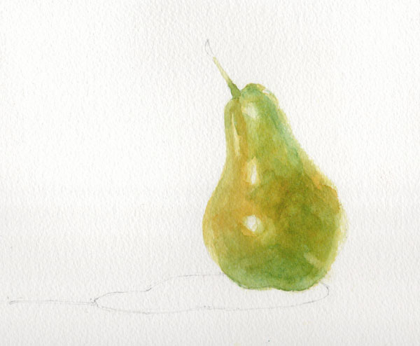
Painting a pear - a watercolour demonstration

For a long time the finished pear in this demo was my logo, and in fact it's still hanging around on business cards, labels and signage. (Well you don't expect someone from Yorkshire to chuck out perfectly good stationery do you?) A step-by-step demonstration showing how I painted it was on my website for a couple of years but this took on a life of its own and spread across social media, forums and Pinterest boards, often without attribution, and copies started popping up with other artists' names on. Eventually the day came that someone saw my signage at a show and said "Oh I know where that pear comes from; you got it off that demo on Facebook, didn't you?". Enough was enough.

I took the demo down from my website and instead made it available as a free pdf which people could request by email for their own personal use. All continued happily until someone casually mentioned that she ran art workshops and she was going to print off lots of copies and use them for classes. Errm... excuse me but no.... write your own course material and handouts LIKE I DO.

At that point I'm afraid I took my ball home and withdrew the demo completely for a while, but being a kindly and generous soul I'm now sharing it with you here. I hope you find it useful - if you try it then please do leave a comment below and let me know how you get on.

*******************

The demonstration shows how to develop colours using wet on dry glazing - this technique exploits the translucent qualities of watercolour so that underlying colours affect and alter the colours painted over them.  It is vital for this method that each layer is allowed to dry completely before adding the next. (All paints used are Winsor & Newton Artist quality).


The painting begins with a layer of Transparent Yellow applied with a size 8 round brush.  The brush should always make first contact with the paper where you want the colour to be strongest; do not simply start at the edge of a shape and 'colour in'.  Here the paint goes on first at the bulge of the pear where it is closest to the viewer; this will help create a sense of form and depth.


Before the paint dries, a clean damp brush is used to soften the edges to increase the sense that sides of the pear are receding.  The edges of the reserved highlights are also softened in the same way.


The first layer is allowed to dry thoroughly.  Before moving on, the pencil outline of the pear is carefully erased before further paint and water can seal it in.  A layer of Quinacridone Gold is added to the warmest areas of the pear skin.


In the next layer we can begin to see the effects of glazing with transparent colours.  A wash of Permanent Sap Green is applied to all but the yellowest areas.  On its own, Sap Green would be too cold and harsh but layered over yellow it softens and mellows.  Again the colour is strongest in the centre, softening towards the edges.  The green is carried a little way up the stalk too to aid continuity later.

Once the painting is dry again, Cerulean Blue is added to areas in shadow.  The effect over the previous yellow and green is to produce a dark green.  Cerulean Blue is a granulating colour so as it dries it will help to add texture to the painting.


The delicate dark green mottling on the skin is painted with a size 4 brush in Winsor Blue (Green Shade).  Tiny dots are added first and then immediately softened and blended with clean water.  It is important that the dots are not allowed to dry before they are softened so you need to work on small areas at a time, moving steadily across the painting.


The same technique is then used to add the red mottling. This is predominantly Cadmium Red which is a strong opaque colour and needs to be used with care.  Kept thin and light at the edges it blends into the earlier colours, but used more strongly in the centre, its opacity means it can stay bright zingy red without being compromised by the underlying green.  In areas which need to be less bright but still strong, a little Permanent Alizarin Crimson is used.


The stalk is painted with a size 6 round brush in Burnt Umber with a touch of Winsor Blue (Green Shade) dropped in half way along.  The colour is blended into the flesh of the pear to make sure the stalk grows out from the fruit and is not 'stuck on'.  The very end of the stalk is deliberately blurred with clean water so that the eye is not drawn to a hard edge and distracted from the pear.
The shadow shape is first painted with clean water.  Winsor Blue (G) is then added in the strongest area on the right and coaxed along to the rest of the shadow shape.  While it is still wet some Sap Green, Transparent Yellow and a tiny amount of Cadmium Red are added to the shadow to indicate reflected colour from the pear.  When the shadow is dry, the area immediately under the pear is strengthened with strong mix of Sap Green and Winsor Blue (G).

Pear with Shadow - © Jane Duke 2011


Thursday, 17 September 2015

Abbeys - creating a new series of collagraphs

Up to now my collagraphs have tended to be small and detailed, often relying less on the structure of the plate and more on the wiping of the ink. I had an urge to do something a bit bigger and looser, and so the idea of a series of prints of landmarks was born. The first two images which popped into my head were of two of my favourite places in North Yorkshire, which both happen to be ruined abbeys. Here are the finished prints of Whitby Abbey (English Heritage) and Fountains Abbey (National Trust).

Whitby Abbey and Fountains Abbey each 30 x 30 cm

And here's a little about how they are made. The first step is to work out the drawings, thinking all the time of how the layers will need to be built up on the plates and the order in which they will be inked up. Once the drawings are finished they have to be traced onto the pieces of mountboard I'm using as plates (remembering of course to reverse the images!).


Then comes the fun bit of building the plates both by cutting away some parts and by adding collage elements. I use different textures of paper, pieces of fabric and pva glue painted on in lines and smears. It's important to remember these are printmaking plates, not collages, so some parts might be counter-intuitive. For instance look at the middle window on the Fountains Abbey tower on the right; I want to 'see' the sky through this, but instead of cutting away a section of the tower which would then just fill with the ink I use for the stonework and be dark (like the small top window), I have stuck on a piece of plain paper which I will be able to wipe clean and then add a little sky colour at the end.


Once the plate is finished it is varnished with several layers of shellac and left for a couple of days to harden completely. Inking up is a long job and has to be carefully planned (you'll notice planning is a recurring theme in printmaking). There's no point adding ink to one area if it's going to be wiped away when you add another. The photo on the left shows the Whitby Abbey plate with the ink laid on the sky, background and pond. I wipe most of this down before adding the ink to the abbey itself, and then there is a lot of wiping, touching up and more wiping. It takes about an hour to reach the stage in the photo on the right, which is the plate ready for printing.


The really magic moment is when you pass a plate through the press and see for the first time what it looks like as a print. There is always an element of surprise - simply the fact the picture is a mirror image of the plate you have been working on for so long means it looks fresh and new.


Then it's time to clean the plate down, prepare another piece of paper and start inking up all over again.....   I'm planning to get editions of 15 of each print but collagraph plates are fragile things. Look what started to happen to the Fountains Abbey plate after just three prints.


Aaaagh! This will need careful repair and then more varnishing before I can carry on.

And meanwhile I'm thinking about what will be the next prints in this series. All I can tell you for sure is that they will be abbeys or churches. They might be all in Yorkshire.... or they might not. They might all be ruins... or perhaps not. We'll have to see where inspiration strikes. Do you have any suggestions?