Showing posts with label watercolour. Show all posts

Tuesday, 6 October 2015

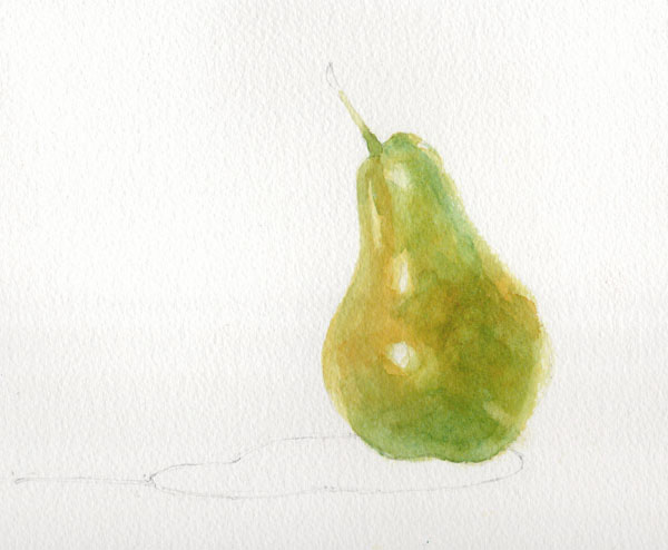
Painting a pear - a watercolour demonstration

For a long time the finished pear in this demo was my logo, and in fact it's still hanging around on business cards, labels and signage. (Well you don't expect someone from Yorkshire to chuck out perfectly good stationery do you?) A step-by-step demonstration showing how I painted it was on my website for a couple of years but this took on a life of its own and spread across social media, forums and Pinterest boards, often without attribution, and copies started popping up with other artists' names on. Eventually the day came that someone saw my signage at a show and said "Oh I know where that pear comes from; you got it off that demo on Facebook, didn't you?". Enough was enough.

I took the demo down from my website and instead made it available as a free pdf which people could request by email for their own personal use. All continued happily until someone casually mentioned that she ran art workshops and she was going to print off lots of copies and use them for classes. Errm... excuse me but no.... write your own course material and handouts LIKE I DO.

At that point I'm afraid I took my ball home and withdrew the demo completely for a while, but being a kindly and generous soul I'm now sharing it with you here. I hope you find it useful - if you try it then please do leave a comment below and let me know how you get on.

*******************

The demonstration shows how to develop colours using wet on dry glazing - this technique exploits the translucent qualities of watercolour so that underlying colours affect and alter the colours painted over them.  It is vital for this method that each layer is allowed to dry completely before adding the next. (All paints used are Winsor & Newton Artist quality).


The painting begins with a layer of Transparent Yellow applied with a size 8 round brush.  The brush should always make first contact with the paper where you want the colour to be strongest; do not simply start at the edge of a shape and 'colour in'.  Here the paint goes on first at the bulge of the pear where it is closest to the viewer; this will help create a sense of form and depth.


Before the paint dries, a clean damp brush is used to soften the edges to increase the sense that sides of the pear are receding.  The edges of the reserved highlights are also softened in the same way.


The first layer is allowed to dry thoroughly.  Before moving on, the pencil outline of the pear is carefully erased before further paint and water can seal it in.  A layer of Quinacridone Gold is added to the warmest areas of the pear skin.


In the next layer we can begin to see the effects of glazing with transparent colours.  A wash of Permanent Sap Green is applied to all but the yellowest areas.  On its own, Sap Green would be too cold and harsh but layered over yellow it softens and mellows.  Again the colour is strongest in the centre, softening towards the edges.  The green is carried a little way up the stalk too to aid continuity later.

Once the painting is dry again, Cerulean Blue is added to areas in shadow.  The effect over the previous yellow and green is to produce a dark green.  Cerulean Blue is a granulating colour so as it dries it will help to add texture to the painting.


The delicate dark green mottling on the skin is painted with a size 4 brush in Winsor Blue (Green Shade).  Tiny dots are added first and then immediately softened and blended with clean water.  It is important that the dots are not allowed to dry before they are softened so you need to work on small areas at a time, moving steadily across the painting.


The same technique is then used to add the red mottling. This is predominantly Cadmium Red which is a strong opaque colour and needs to be used with care.  Kept thin and light at the edges it blends into the earlier colours, but used more strongly in the centre, its opacity means it can stay bright zingy red without being compromised by the underlying green.  In areas which need to be less bright but still strong, a little Permanent Alizarin Crimson is used.


The stalk is painted with a size 6 round brush in Burnt Umber with a touch of Winsor Blue (Green Shade) dropped in half way along.  The colour is blended into the flesh of the pear to make sure the stalk grows out from the fruit and is not 'stuck on'.  The very end of the stalk is deliberately blurred with clean water so that the eye is not drawn to a hard edge and distracted from the pear.
The shadow shape is first painted with clean water.  Winsor Blue (G) is then added in the strongest area on the right and coaxed along to the rest of the shadow shape.  While it is still wet some Sap Green, Transparent Yellow and a tiny amount of Cadmium Red are added to the shadow to indicate reflected colour from the pear.  When the shadow is dry, the area immediately under the pear is strengthened with strong mix of Sap Green and Winsor Blue (G).

Pear with Shadow - © Jane Duke 2011


Tuesday, 8 September 2015

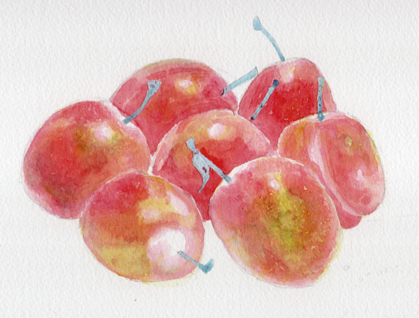
Seven Plums - watercolour demonstration

I recently took down the demonstration pages that had been on my website for several years. They were getting a bit stale and I'm not planning on reproducing them all here. However this was a particularly popular one and I still refer to it in my Watercolour Improvers workshop, so I thought I'd give it a new home here on the blog.


The idea of this demonstration is to show how careful planning of glazes can produce vibrant and fresh colour, even when using all three primaries layered together. The effect you get from layering in this way is completely different from mixing the same paints together on the palette.

For this study of plums I needed a range of hues including yellow, green, red and purple.  I spent some time experimenting with layering different colours and planning the order in which I would work. The chart below shows the colours I planned to use and the swatches along the bottom show the results of the different combinations.The colours would be layered starting with the yellow and working through to the violet, but not all areas would have all the layers or in the same intensity. For instance the yellow is used more lightly in the areas which will also have cobalt blue and violet to avoid the colours turning dirty green.
All paints are Winsor & Newton Artist range.


OK so that's the planning - now for the execution. The first wash is Transparent Yellow.  It is applied lightly in some areas and in others is not used at all, depending on what the eventual colour is to be. The stalks have been protected with blue tinted masking fluid.


Then Cerulean Blue is added. I add this only where I want to achieve swatches 2 and 3 on the chart.


Then Permanent Alizarin Crimson goes where I want to achieve the colour swatches 3 through to 6. Do you see how this is working?


Cadmium Red goes on next...


..then Cobalt Blue...


..and finally Winsor Violet (Dioxazine). There were just a few tiny areas that have been left unpainted until this point so they now have only pure Violet on them (the last swatch on the chart, number 8).


Here's the finished piece with shadows, lace and stalks added.  The shadows and lace holes are all painted with colours used previously (Cobalt Blue, Permanent Alizarin Crimson, Transparent Yellow, Winsor Violet) but because here the paint has been mixed on the palette instead of being painted in layers on the paper, the result is muted neutrals rather than the vibrant colours of the plums

'Seven Plums' - © Jane Duke 2011

I hope you enjoyed this demo and found it useful. Do let me know what you think in the comments below.

The legal copyright bit (sorry but unfortunately this is necessary):
You are very welcome to follow this demonstration for your own pleasure, but please remember that exhibiting or selling the resulting painting without acknowledgement is copyright infringement.

Thursday, 20 August 2015

The Most Happy

I love Hampton Court Palace. I mean I really love it. I love it so much I get a bit weepy just walking through the gates. Visiting from York entails a round trip of 500 miles and an overnight stop in a budget hotel, but it's worth every traffic cone and little plastic pot of UHT milk. Just being there makes me 'The most happy', the phrase Queen Anne Boleyn adopted as her motto.*

When we visited last weekend we headed straight for Henry VIII's kitchens, getting there before the crowds who had been waylaid by the signs to the Great Hall. The costumed cooks had just got the huge open fire going and were starting to spit roast a couple of large hunks of meat. The guides told us that the most common question they are asked by visitors is "Is that a real fire?", which is quite shocking and rather sad. I suppose that in a world of central heating and electric ovens, it is possible for people to go through life without ever seeing real flames and so not be sure what a wood fire looks (or sounds or smells or feels) like.

Look! Earthenware, wood, wicker, stone, herbs... so much loveliness.

Rather a blurry action shot, but I love the way it looks like a Brueghel painting.
After the kitchens we moved on 150 years to William III's apartments (also empty - "Everyone goes to the Great Hall first" said a guide, with a hint of sadness) and made an initial foray into the gardens, before we too succumbed to the lure of Tudor apartments and the Great Hall, where we encountered a team of 'Time Players' in period garb performing 'Pastime with Good Company'. The rest of the palace followed after lunch, including George I's Chocolate Kitchens (yes two rooms JUST FOR CHOCOLATE; forget a gift wrapping room, a chocolate kitchen must be the ultimate sign of a luxury home) and more time in the gardens, which now have 500 deckchairs to mark the 500th anniversary of the palace.  We availed ourselves of two for a while. (If you read my blog post about Chirk Castle you might detect a recurring pattern here.)

Why don't more gardens have fantasy beasts on striped poles? They're wonderful.
The sound track for our journey home was a Music for Feasting CD bought in the gift shop - medieval and Tudor smash hits played on period instruments (Now That's What I Call Minstrels). We head banged in the car in Wayne's World fashion and sang along in Latin.

You might have guessed by now that I am a bit of a Tudor nerd, which is one of the reasons that earlier this year I started a series of hand tinted drypoint etchings based on Tudor drawings. The first two I've completed are taken from Holbein sketches of Anne Boleyn and Jane Seymour. The watercolour hand painting of each print, along with the fact that the ink colour is varied for each impression, means that each print is unique (a monoprint). There will be no more than 40 prints in each edition.

Hand tinting an 'Anne Boleyn' etching with watercolour paint.

Tudor Series - drypoint etchings with watercolour tinting
Oil based ink and watercolour on 140lb watercolour paper
Image size 14 x 20.5 cm


*Compare and contrast with the 'Bound to Obey and Serve' motto of her straight-laced successor, Jane Seymour. Oh Henry you silly man.

Monday, 27 July 2015

Who is Stoneflower Stu?

I’ve used the name Stoneflower Studio for more than seventeen years and quite often I am asked where the name comes from. Equally often, it has to be said, people think I must have meant Sunflower and just call me that instead: amusing when written on an envelope, less funny when written on a cheque. On one memorable occasion, the advertising editor of a local magazine decided I had made a mistake when submitting copy and so helpfully corrected the text to read ‘Sunflower Studio’. To reassure me that it was really no bother she kindly added an image of sunflowers to the background of the ad too. I think she was quite hurt that I didn’t appreciate her efforts.

So anyway how did I start using this name? In 1997 our brand new house was being built, along with several others, on disused industrial land between existing houses.

Autumn 1997
When our neighbours’ properties had been built several decades earlier, the planners had shown a distinct lack of foresight and imagination (or indeed planning, which was their job) and failed to hold back any spare house numbers, so now we would have to be 25a, alongside 25b, 25c, 27a and 27b as well as the original 25 and 27. We anticipated trouble, mis-delivered post and unordered pizzas* so those of us watching our new houses being built decided we needed house names too. After much deliberation I had the stroke of genius which was ‘Stoneflower’. It was so right! It was so perfect! But just as we were about to order a sign and notify Royal Mail and the Fire Service, our children deployed the downcast lashes and small voices tactic and murmured that they’d always liked the name of our old house [insert heart tugging sigh here]. Instant parental deflation was piled onto the guilt already felt at uprooting our six and four year olds from their home 200 miles away and thus the old name, 'Alderley', was duly re-used. What a shame we'd left the house sign behind.

But I still haven’t explained about ‘Stoneflower’. Well it comes from the names of our children – yes that’s right, the ungrateful ones who spurned my suggestion of immortalising them in a slate plaque on the front of the house. Our son is Peter, which I’m sure you know comes from the Ancient Greek ‘Petros’ meaning stone. Our daughter is Poppy, which should not require any explanation for the flower bit. Having come up with such a wonderful, meaningful name (even if this view was not shared by the children), I didn’t want it to go to waste so decided to use it as my business name.

A watercolour I painted of the children in 1998
I have since discovered Stoneflower Studio won’t quite fit on my bank card where the embossing reads STONEFLOWER STU. I rather like the sound of Stoneflower Stu. He sounds cool. I imagine him as a banjo player supporting Seasick Steve on tour. When I joined Twitter I considered becoming StoneflowerStu but settled for @stoneflowerjane. Perhaps I should give Stoneflower Stu his own account. I wonder what he would tweet about?

*By the way we were proved right. And having house names didn’t help after all.